Redesigning the Ad Process to Reduce Refund Requests
Lorem ipsum dolor sit amet, consectetur adipiscing elit. Proin elementum sem neque.
Summary
Tisitano is a company that provided a website and app that allows users to buy from, sell to and chat with others locally. There are more than 25k active users at Tisitano in Africa, and the company is currently focused on other countries. I was assigned the task of improving the process for users to be able to submit their ads photo.
Challenge
The lack of photo uploads by users has led to an increase in the number of ads without photos on the home page and increased refund requests by users.
How might we create an experience for users that helps they easily add photos to their ads?
Outcome
We researched, redesigned, and prototyped the process which resulted in ad info in the new ad and made it easier for users to have at least a single photo on their ad. Default photos became the newly added feature. Furthermore, the new design was created to ensure users do not make the same mistakes they did before.
My Role
My responsibility as the product designer was to conduct user research and analyze analytics data. Then I explored layout and visual design alternatives, evaluated and prototyped the final design.
Team members
2 Designer + 1 PM + 2 developer + 1 QA
01. Understand
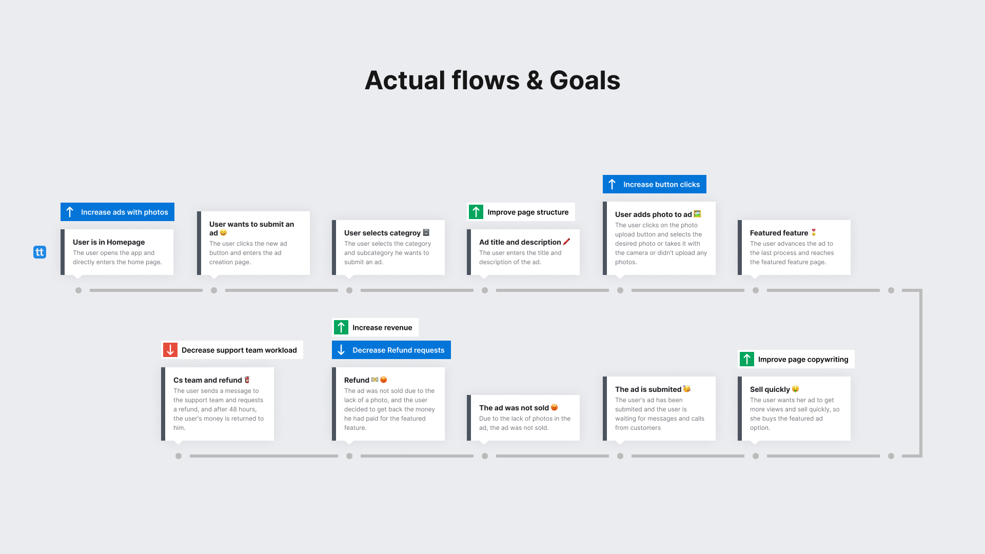
Context
The ad photo is the most important part of Titsitano product. The majority of users who intend to submit and sell their ad will need to upload photos for a better experience. Ads with photos sold faster or were seen more frequently than ads without photos.

Problem Definition
Out of some issues identified, 4 stood out as clear problems for users and the business:
- Small upload button: Most of users who intended to create an ad, they couldn't see photo upload button.
- Lots of ads without photo: Most users did not have a photo of their product in the gallery or did not want to take a photo with the phone's camera.
- Lower featured ad revenue: When some users purchased ad-featuring but did not have a photo, they asked for a refund for it.
- Lack of page structure hierarchy: Due to the lack of a clear structure and order, the order in which information is displayed on the page is confusing, the most important section being at the bottom.

User problem
Uploading photos wasn't transparent for users and sometimes users didn't upload ads because they were lazy with the photos
Business problem
Business wanted to sell more features and reduce the amount of refund requests and increase ads with photos in the service.
Metrics
- Refund requests should decrease
- Increase the number of ads with photos
- Increase the number of click rate on photo upload button
- Number of default photo usage
Discovery
Highlights
We unearthed useful insights through analytics data, usability test, and user research:
- Over 480 (47.62%) ads do not have photos out of 1008 ads in a month
- Most users was lazy about uploading a photo and editing in app
- Most users forget to upload a photo to their ad
- Users preferred to choose random photos from the photo gallery that related to their ad

02. Gain Confidence
Ideation
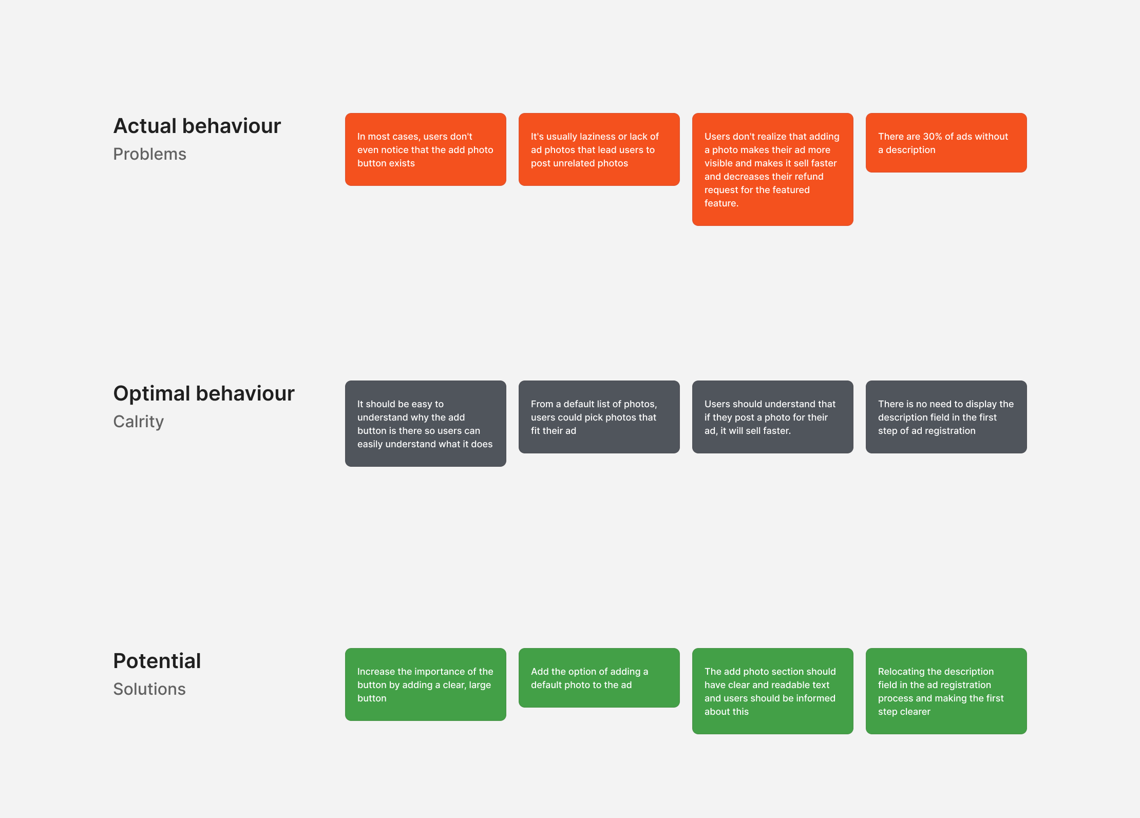
Then my main goal was to optimize the user experience for clarity, not just simplicity. As a result, I mapped out my thoughts in a matrix, highlighting the existing problems and matching them with optimal behavior. This helps me develop ideas quickly and turn them into designs.
With my teammate, We sketched out a number of different model wireframes for Mobile and web.
Together, we discussed pros and cons of each wireframe, and quickly converged on a prioritize model that would best users' needs while also supporting the requirements of Tisitano.
Finally, I prototyped a few different mobile and web wireframes and team and I ran light wireframe testing on each.
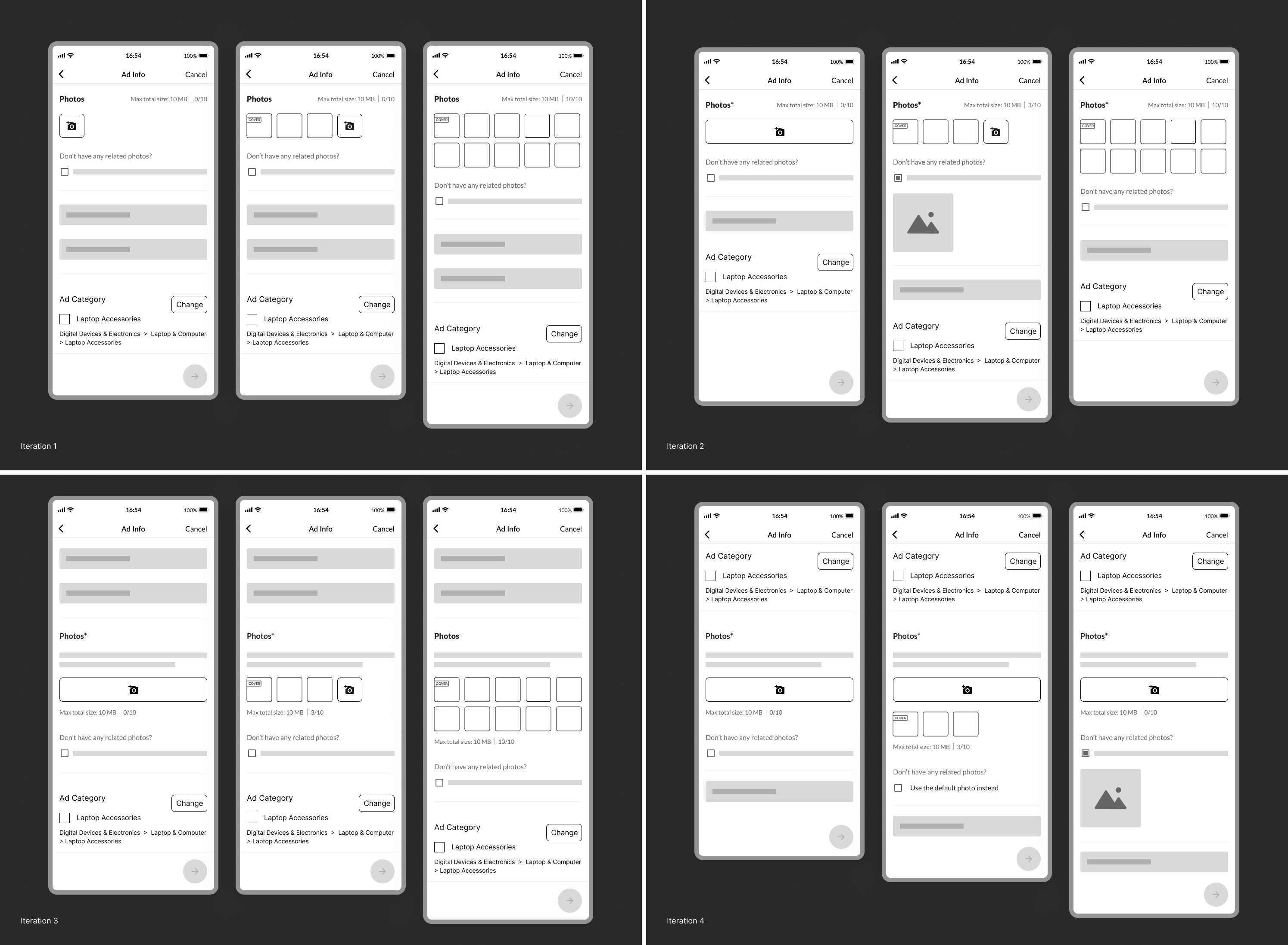
Validate + Iterate 🔄
We rolled out changes as new-experiments:
• Iteration 1:
What were the first iteration problems?
- There was still no requirement for the photo to upload.
- There was still a lack of attention to the upload button for photos.
- Despite our best efforts, we were unable to modify the patterns of some of the objects.
• Iteration 2:
What were the second iteration problems?
- The priorities of the page have been completely changed, which is not desirable.
- There was no motivational text regarding the uploading of the picture in the design.
- By moving the category to the last section of the page, the user may get confused about new layout.

• Iteration 3:
What were the third iteration problems?
- We found the layout of the page to be boring and unattractive, and scrolling was actually necessary based on the layout.
- This description on this page seemed to be redundant at this point in time.
- Layout priorities had changed, and the team found it strange.

Solutions:
Our goal was to thoroughly evaluate and redesign the four main problems that we identified in our analysis 🚀
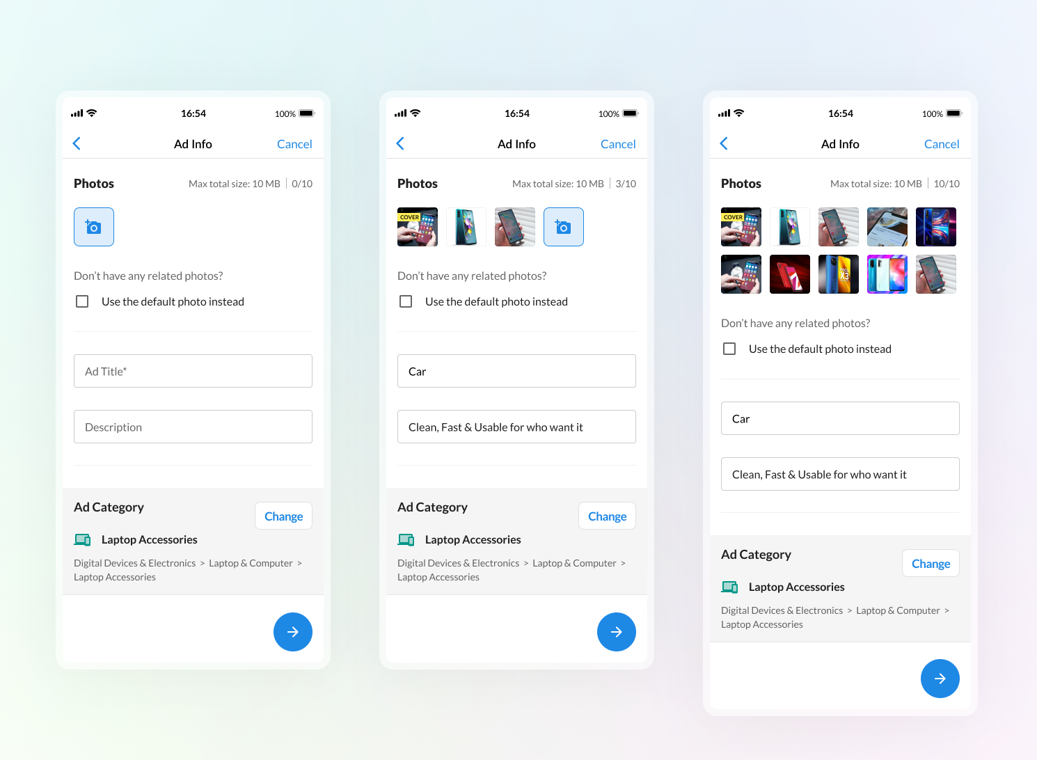
• Layout improvements
The first design focused on making it easier for users to upload photos without any lazying.
Through changing the layout of the mobile, we made it easier for users to upload photos to their ads by increasing the button size and moving the add photo section from below to top.
• Mandatory photo
Based on users and business needs, we had increase the add photo priority in ad info page.
• Default photo feature
Additionally, we added a default photo option for users who don't want or can't upload a photo with their ad.
• Change the description field
We changed the location of the description and added a text that informs users not to share their information.
03. Polish
Designs & Prototypes
Along with final visual design, I built prototypes in figma for Mobile and web. Prototype helped us to demonstrate how interactions looked, and were also a resource for our engineers.

• Layout improvements
Users paid the slightest attention to the most critical parts of the page before, so this was improved by the new design.

• Mandatory photo
Most ads have been without photos because of the optionality of the photo, now users are required to upload photos. Their attempt to continue will be interrupted if they do not upload a photo.

• Default photo feature
It is possible for users to use the default photos for their ads if they are unable to upload their own photos or cannot find one suitable to their ad.

• Change the description field
As most users didn't complete the description or add any personal information, such as a phone number or email, we changed the location of the description and added a text that informs users not to share their information.

04. Results
The project was a success on all fronts.
- Now all ads have photo: 100% of ads that are submited in Tisitano now have photos.
- Larger button: According to Google Analytics data, the click rate on the add photo button increased from 52.2% to 77.7% (25.5% Increased).
- Reduced refund costs: 173 users (36%) out of 480 users who requested a refund for the featured feature in the previous month, after the release of this feature, this number decreased to 13 people. (92.4% decreased)
- Default photo: After one month, the rate of users tapping on the default photo section reached 386 out of 1143 people who had submitted the ad. (33.7% Users used default photo feature).
Learnings 📖
- Power of simplicity: Previously, we thought our previous design was simple and easy to understand for users, but we learned that simplicity is not the most important condition as the most important thing is clarity of the design.
- Hand-off: Make sure that you find ways that you can make the engineer’s life easier (e.g. hand-off in small, quick iterations).
- Using a local translator for remote usability testing: We did not have any experience with this at all, because the team had not run a test until this one was done. However, after the test, it was a good experience for us, in which we learned a lot.
- In any project, design is never done: This is especially true when there are frequent design critiques and constant feedback from PMs and teammates. You need to be able to determine what's the next step.
Thank you 🙏


"Lorem ipsum dolor sit amet, consectetur adipiscing elit. Proin elementum sem neque, et posuere erat interdum vitae.”
Next Project