Building a product-centric community platform that connects consumers and customers
Lorem ipsum dolor sit amet, consectetur adipiscing elit. Proin elementum sem neque.
Summary
Peers is an embedded community platform designed for e-commerce. It Is the place where your website visitors can interact with your customers to learn more about your products and have an easier time making a purchase decision.
Challenge
Creating a community-based platform that connects consumers and customers through a focus on products.
How might the design of a community-based platform facilitate connections between consumers and customers by focusing on products?
My Role
As a start-up is a very dynamic and fast-developing environment, it was important within a short period to complete research and arrive at a solid result. As a part of an Agile team, I was doing various tasks within sprints. I was responsible and participated in most of the project phases. Then I explored layout and visual design alternatives, evaluated and prototyped the final design.
Team members
1 Designer + 1 PM + 3 developer
01. Understand
Previous Context
Videorepute was a video-collecting platform for online businesses. As soon as a new customer places an order, videorepute sends an invitation to film a quick video with the chance to win money.

So, what happened?
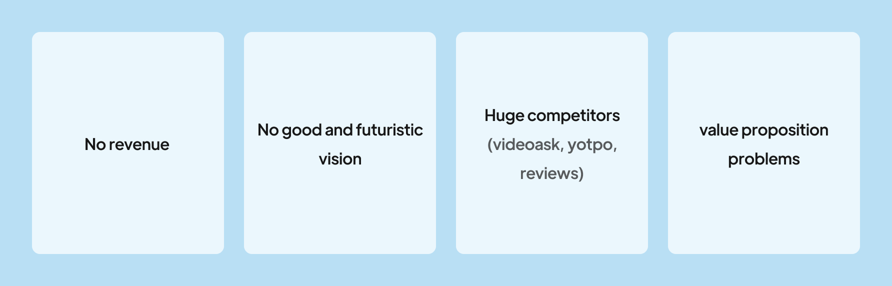
As a result of the problems with the value proposition and the presence of larger competitors, as well as the simplicity of the application, we decided to remove it from the market. This app took a lot of effort from us, but because we couldn't offer any competitive advantage, that's why we had to do this.
What did we do?
It was important to us that we came up with a new idea in order to accomplish what we wanted. Finally, it was time to build Peers. Peers is the culmination of workshops, meetings, and creative ideas that succeeded and those that failed.

Metrics
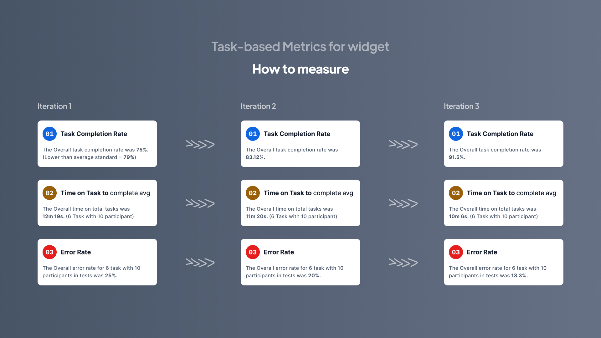
- Task-based Metrics for widget: Task Completion Rate, Time on Task, Error Rate
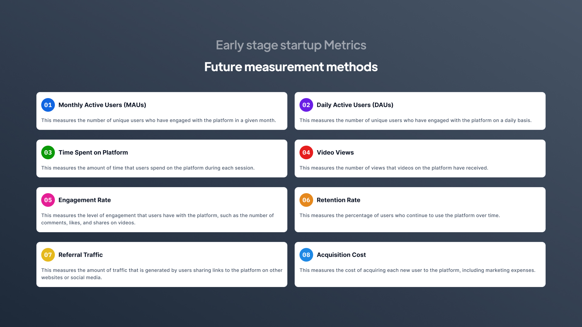
- Early stage startup Metrics: MAUs, DAUs, Time Spent on Platform, Video Views, Engagement Rate, Retention Rate, Acquisition Cost
Problem Definition
Online shoppers demand more authentic reviews about the product in order to make a decision.
- They often have to leave the product pages, spend time and search through social media channels for reliable feedback.
- There is no easy way for them to have conversations with previous buyers about their experiences (The most authentic answer to their questions.

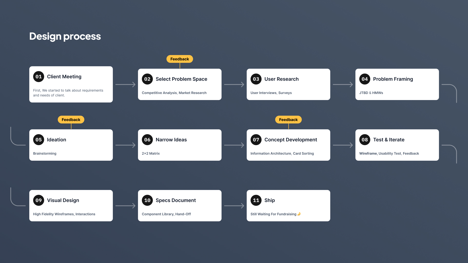
Discovery
Select Problem Space
Competitive & Market Research
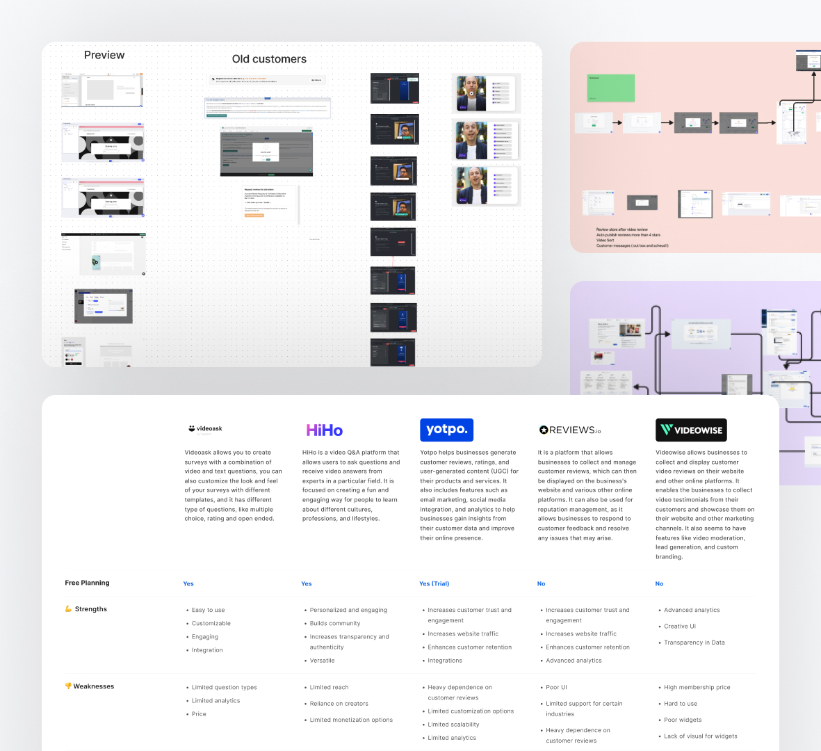
I always liked to conduct research on competitors before starting to design anything. This technique allowed me to identify what competitors in the same field are doing right or wrong and how they solve the problems I am trying to solve. I put together a presentation on the main user’s flow, with screenshots and notes to explain my findings regarding competitors’ apps strengths and weaknesses, seen as opportunities to do better.
User interview & Surveys
We began interviewing users and store owners who would have experience using review apps in their stores. Through interviews with 18 people, we have been able to discover the problems, needs, and reasons behind the lack of trust that users have in review platforms by conducting user research.I created an online survey with Google Forms and I shared it via email and WhatsApp with 30 friends, making sure that the purpose of the survey and the reason why I needed their help was clear.

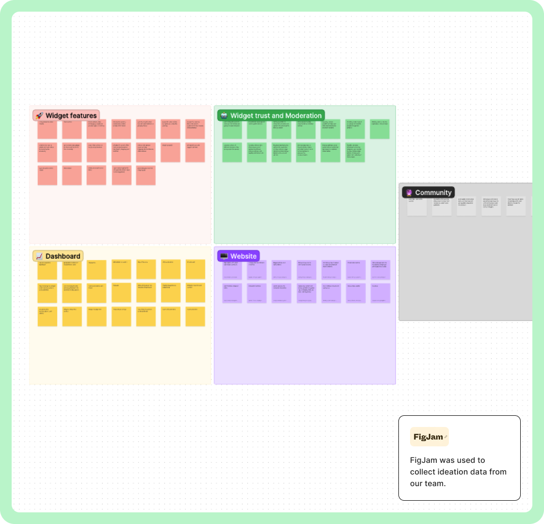
Affinity diagram
I had accumulated a large amount of qualitative and quantitative data from my research, but it was disorganized and difficult to make sense of. I needed to create structure and identify connections between common themes. I found the affinity diagram to be the most effective tool for this task. Ideally, this would be done as a team activity, but I did it alone using FigJam board. The process required me to frequently refer back to my research data, and I realized the importance of taking clear and organized notes.

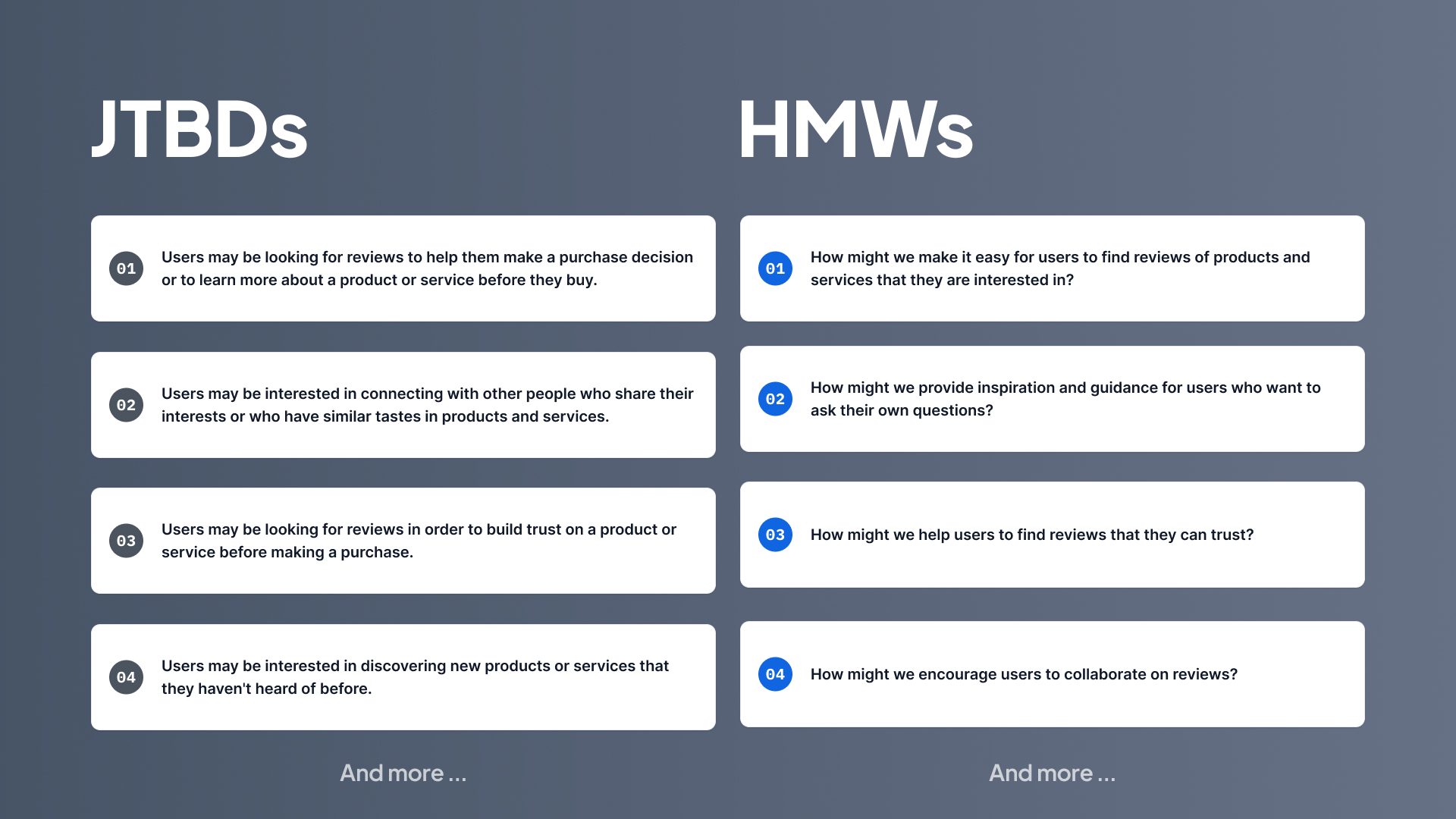
JTBDs & HMWs
We used JTBD to understand the underlying motivations and needs those drive users to seek out a product or service. By understanding a user’s JTBD, we could create solutions that effectively address their needs and goals.And we used HMW for generating potential solutions to problems users had. We used JTBD insights tried to have solutions in brainstorming sessions. By combining these two concepts, we could create better solutions.
02. Gain Confidence
Ideation
Brainstorming
With a team that consisted out of designer, product manager, and developers, we gathered to brainstorm ideas.After we had data from interviews and questionnaires and defined them in the form of JTBDs and HWMs. We tried to focus on the needs of users and their pain points and provide solutions that can cover those needs in the short term.
We divided our ideas into several product sections and started brainstorming sessions.These meetings were accompanied by all team members and we were able to present enough ideas for MVP for all categories. First, without considering the limitations and technical problems, we developed ideas to have new ideas as much as possible.
We started prioritizing the ideas we had for the platform. We prioritized all the ideas of the categories, including dashboard, widget, community and website. We prioritized these ideas by considering Cool and Normal, and Doable and Impossible. Finally, we selected the ideas that had coolness and the ideas that had higher Feasible (Doable) to develop in the MVP version.

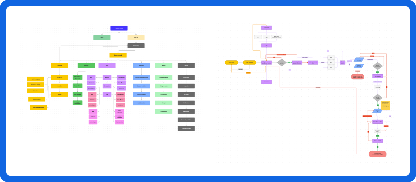
Information Architecture & Flows
The information architecture and user flows were designed to make it easy for users to find relevant content and connect with others in the community, resulting in a streamlined and user-friendly experience.
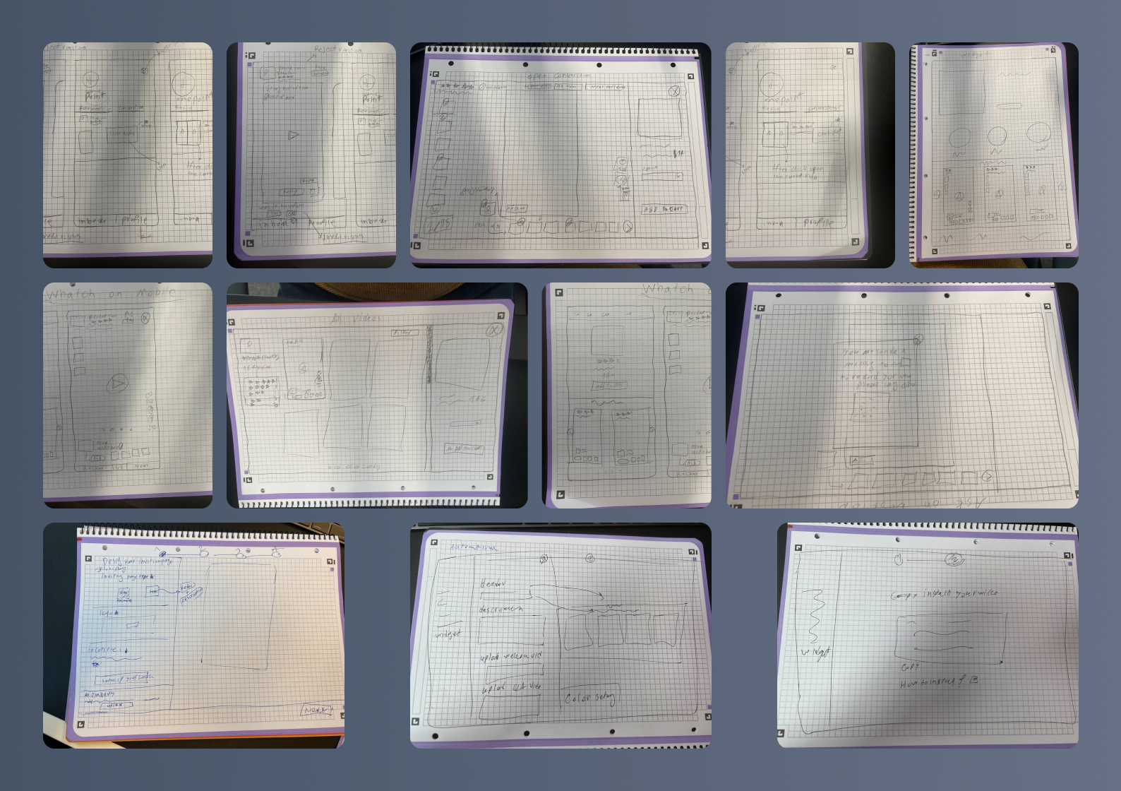
Wireframe, Usability test, Feedback:
Lo-fi & Hi-fi prototypes - were started with stakeholders weekly to get feedback on the functionality, content, and interactivity of the product.
Unmoderated usability testing - Users could be classified into two categories: business owners/consumers, and normal users. We started remote usability testing with these people. All participants were using the app to carry out hypothetical tasks.
Feedback - With the feedback we got from testing the product with potential and normal users. We tried to fill the usability gaps of the product and launch the product with a better experience.
Usability test, Feedback
As part of our design, we performed unmoderated usability testing on high-fi designs with 10 users with a view to evaluating the usability and user experience of our design. The findings and observations gathered from the testing provided valuable information to help us improve the design.
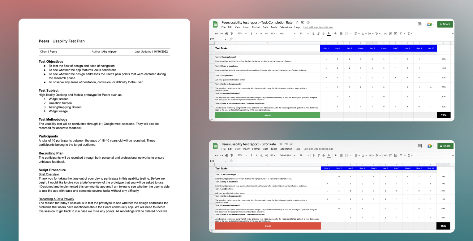
Although users encountered difficulties with certain tasks, they generally expressed satisfaction with the product and the experience it provided.
03. Polish
Designs & Prototypes
Along with final visual design, I built prototypes in figma for Mobile and web. Prototype helped us to demonstrate how interactions looked, and were also a resource for our engineers.

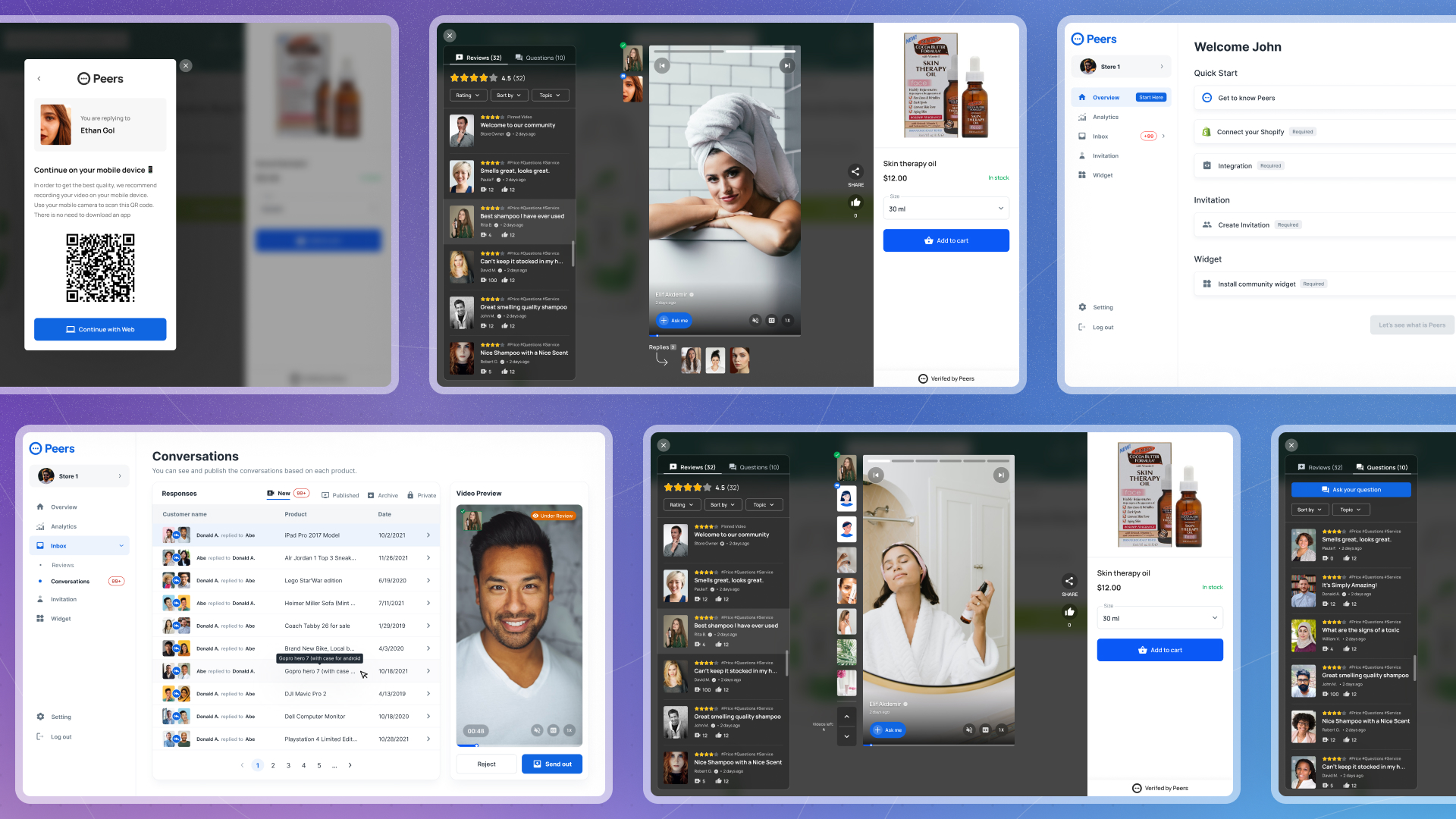
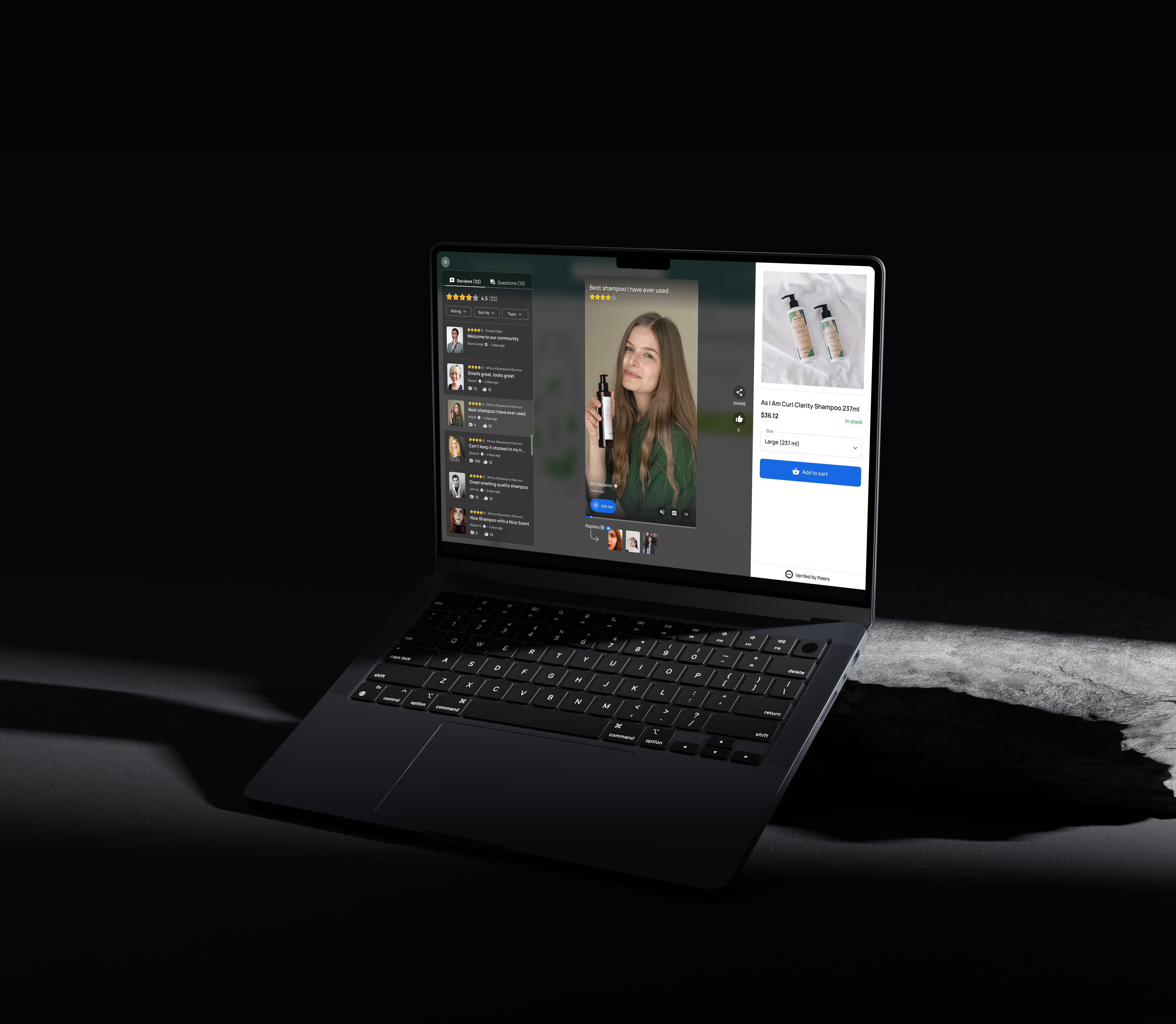
• Peers community
Two main functions of the widget can be seen here: 1- Widget on a product page 2- Widget in open state
As soon as the user enters the product page, if the owner of the store has installed the widget on the product page, the user can easily access and listen to all the videos and voices recorded by users, assisting the user in making a more informed purchasing decision. Users can share the review videos with their friends and show their satisfaction with that review by liking it. On this page, users can mute or unmute the video or voice, enable or disable subtitles, and speed up the video.
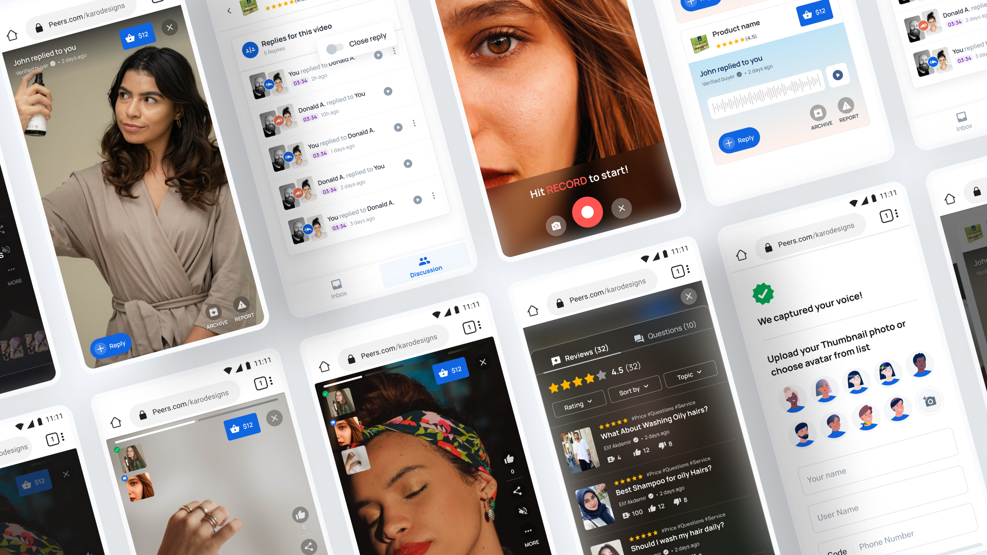
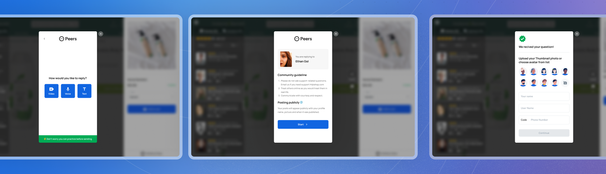
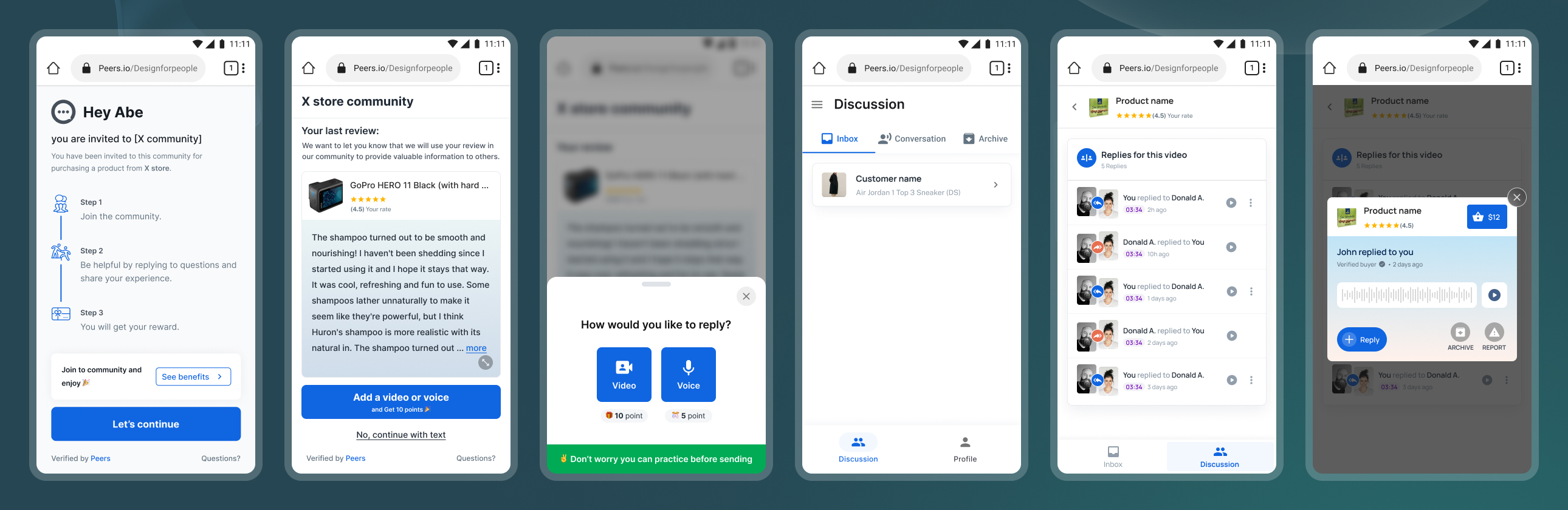
• Asking/Replying
When the user wants to give his opinion to a review, he can do it by simply clicking on the Ask me button. After clicking, the user sees the community rules and after agreeing, he enters the page of choosing the type of content he wants to send in the form of a comment/review. Finally, the user writes his phone number and if the owner of the review answers this user's opinion, he will be notified.
• Consumer Invite & Dashboard
When the store owner wants to receive a video or voice review from his previous user. It sends the user an invitation link to the community, and after the user accepts, he starts recording the video and sending it to the store owner. Then the user can see his video in his own dashboard and manage his replies and reply if needed.
04. Results
The project was a success on all fronts.
Outcomes 🤌
- Team: With a small team we were able to design, build test and iterate creating a fully functional social platform within just a few months
- Feedback: After the final design of the product, we tested the product with the users we had previously interviewed and they were very interested in the product. Also, investors really like our platform and want to invest.
- Product hunt: We launched Peers on Product Hunt before the final launch and we have received good feedback so far. We currently have 111 upvotes.
Learnings 📖
- Prioritize: Create a strategic plan to launch an MVP. This helps deal with out-of-scope requests that could potentially derail the project and helps deliver a quality product in time.
- Time: Time is like gold in a startup. Everything depends on time so that everything is completed on time. Being punctual was one of the things I learned during this time and I tried to do more things with higher priority in less time.
- Test, Test: The most important thing to do in the design process, when we reach the wireframe stages, is to start testing all of the designs because the sooner you fail all of the tests, the more chance you have of improving the usability.
Thank you 🙏

Next Project