Easy Fare Adjustments with Flexi Pricing
A Data-Driven Initiative to Reduce Wait Times, Increase Driver Earnings, and Generate Significant Profit for Snapp.
Background
The ride-hailing industry is fiercely competitive, with users demanding faster pickups and more flexible ride options. To stay ahead, companies need features that cater to both passenger preferences and driver incentives. Flexi Pricing was introduced as a solution that allows passengers to pay extra for a quicker ride, while motivating drivers to accept rides more promptly.
What Is Snapp?
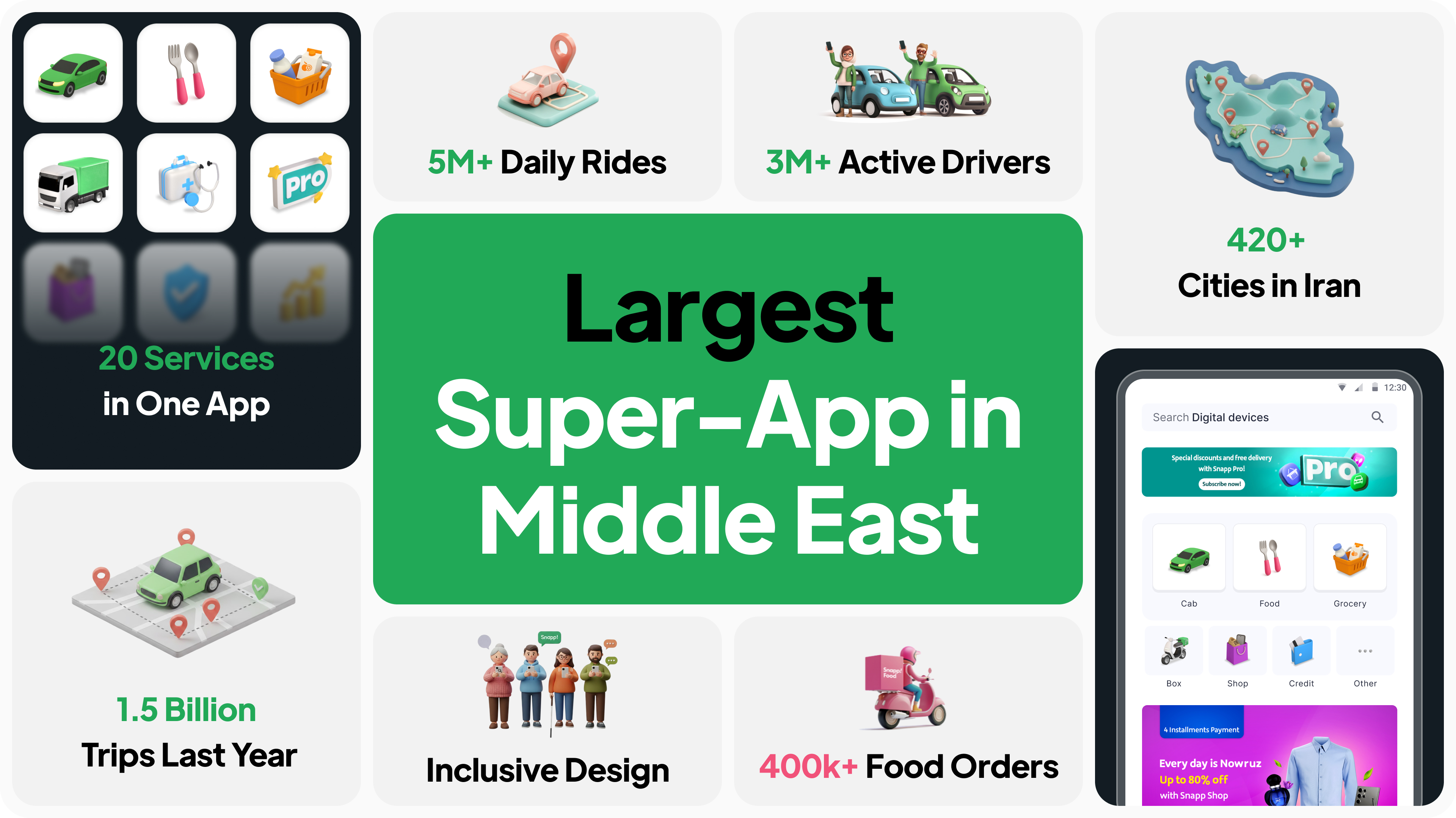
Snapp! is Iran's leading ride-hailing platform, connecting millions of passengers with drivers for convenient and affordable transportation. With over 60 million registered users, Snapp! facilitates an astounding 5 million rides per day across numerous cities in Iran. The app offers a wide range of services, from economical rides to luxury options, ensuring diverse transportation needs are met.
My Contributions
I led the design to create an intuitive solution. In close collaboration with a team comprising 1 designer, 1 user researcher, 1 UX writer, 2 product managers, 1 data analyst, 3 software engineers, and our design lead, I focused on designing with users in mind while legal, and technological constraints. We worked together to successfully roll out a new feature that boosted user satisfaction and made a big impact on the company's revenue growth.
- Year: 2024
- Duration: 2 Months
- Role: Product Designer
- Lovely Colleague: Paria Adibzade
Outcomes
- The Flexi feature resulted in the generation of $720,000 in Gross Revenue within the first 30 days of launch.
- Drove user adoption of the feature by 2.7 times (or +176%) in the first month.
- The average GMV per ride for Flexi trips was consistently 5% to 10% higher than standard rides, directly improving the profitability of each transaction.

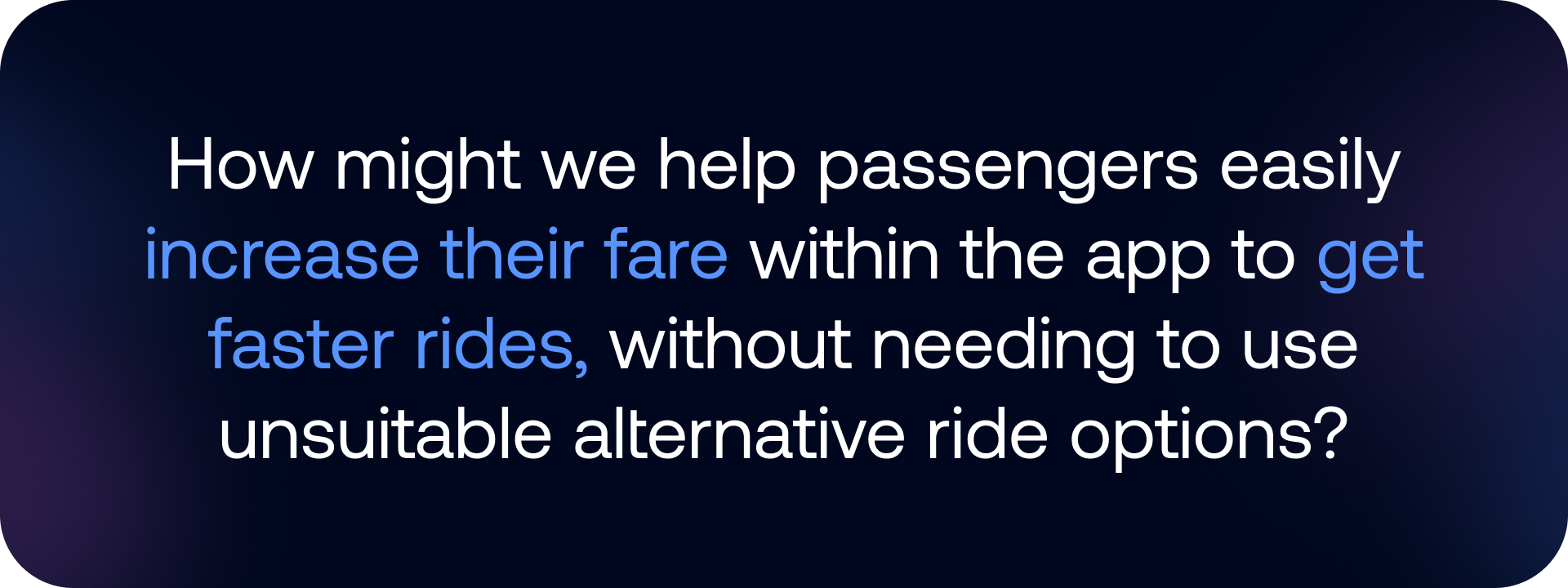
1. Problem statement
2. One Step Back
Before Flexi Pricing, we had a feature called Ride In-Hurry that aimed to help time-sensitive passengers get a faster pickup. However, after reviewing the feature, the government regulatory determined that it wasn’t clearly beneficial for passengers, felt unfair in certain cases, and didn’t have a strong enough logical justification behind it.
As a result, the government required both Snapp and Tapsi to remove Ride In-Hurry immediately. This sudden change left a noticeable gap, the user need didn’t disappear, but the previous solution was no longer allowed.
3. Design Rationale
The government told us we had to kill our "Ride & Hurry" feature. It was gone. This wasn't just a minor setback, we suddenly lost our main tool for balancing the marketplace during rush hour. Our acceptance rates took a serious dive, and users were just stuck.
But the funny thing about users is, if they need something, they'll find a way. We saw this bizarre trend in our data: People were getting super creative, manually adding fake Stops, Stop Time or selecting a Round Trip on the map. They weren't actually going round-trip; they were just trying to artificially pump up the price to bribe a driver to pick them up.
This whole "user hack" was a disaster for us. For users, it was a painful, clunky experience, also way too many taps just to get a ride.
For the business, it was worse, it polluted our data, making our estimated time of arrival (ETA) predictions totally unreliable and confusing the drivers. We couldn’t just let this terrible workaround become the new standard.
Since the government had killed the automatic price-surge feature, our new solution couldn't look like we were systematically "price-gouging." The key design mandate for Flexi became The price adjustment had to be 100% opt-in and user-initiated. We had to make it function as a voluntary bid or premium option, not a mandatory price hike by the system, to stay on the right side of the regulations.
At the same time, we had to respect strict constraints 🚫:
- Stay compliant with government regulations
- Avoid anything that looks or feels unfair
- Keep the UI simple enough that people understand what’s happening with the price
4. A Short Discovery
Since this project came right after the removal of Ride In-Hurry, we didn’t have much time to run proper user interviews or deeper research. The team needed a direction quickly, and I needed a way to get started without waiting for more data.
I reviewed how other ride-hailing apps approached similar pricing features, what patterns they used, and how they communicated fairness and flexibility. This helped me get a clearer picture of what could work for Snapp and what users might already be familiar with.
4.1. Exploring The Solution
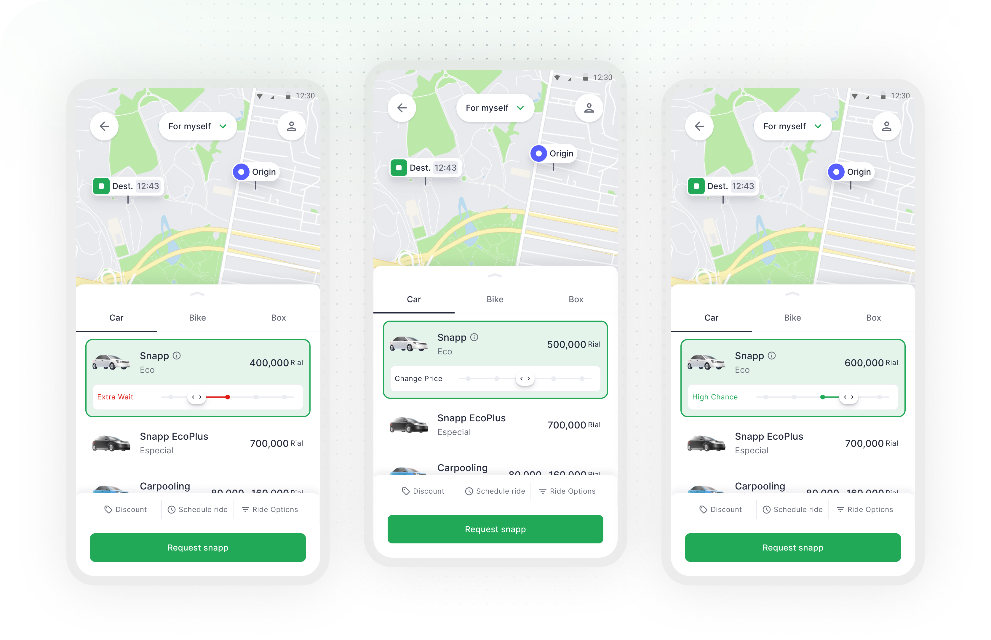
We explored several directions for letting passengers increase their fare. At this stage, we were working from rough ideas, not a final concept. In the early approaches, we added new ride options and extra steps in the flow. But after reviewing these concepts with the design director and the pricing/product team, it became clear that the patterns felt unfamiliar, the experience became heavier, and the layout took too much space on the price check page.
Then, we experimented with predefined fares and more granular controls using plus/minus buttons. The idea looked flexible in Figma, but during discussions it was obvious that the technical load would be high, and simple actions, like raising the fare, would feel slow and frustrating for passengers. We also tested a later version with a bottom sheet and a wide-range “preferred fare” slider. It initially seemed powerful, but choosing a precise amount within that range would be confusing and difficult to control in practice.
These rounds of internal feedback did not give us the final answer, but they helped us eliminate what was not working: too many options, too much friction, and unnecessary complexity in a moment that should remain fast and simple for passengers.
5. Final Solution
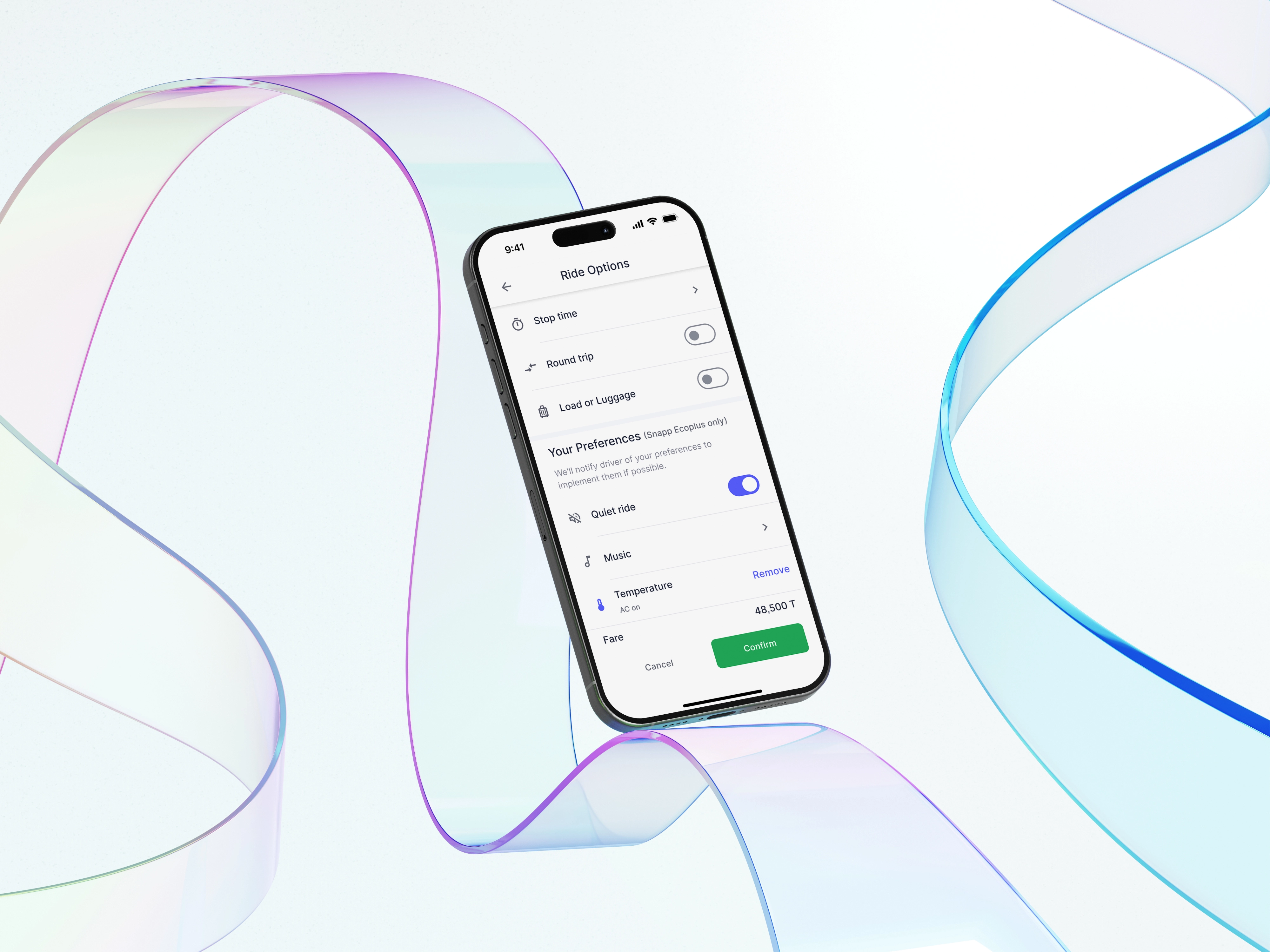
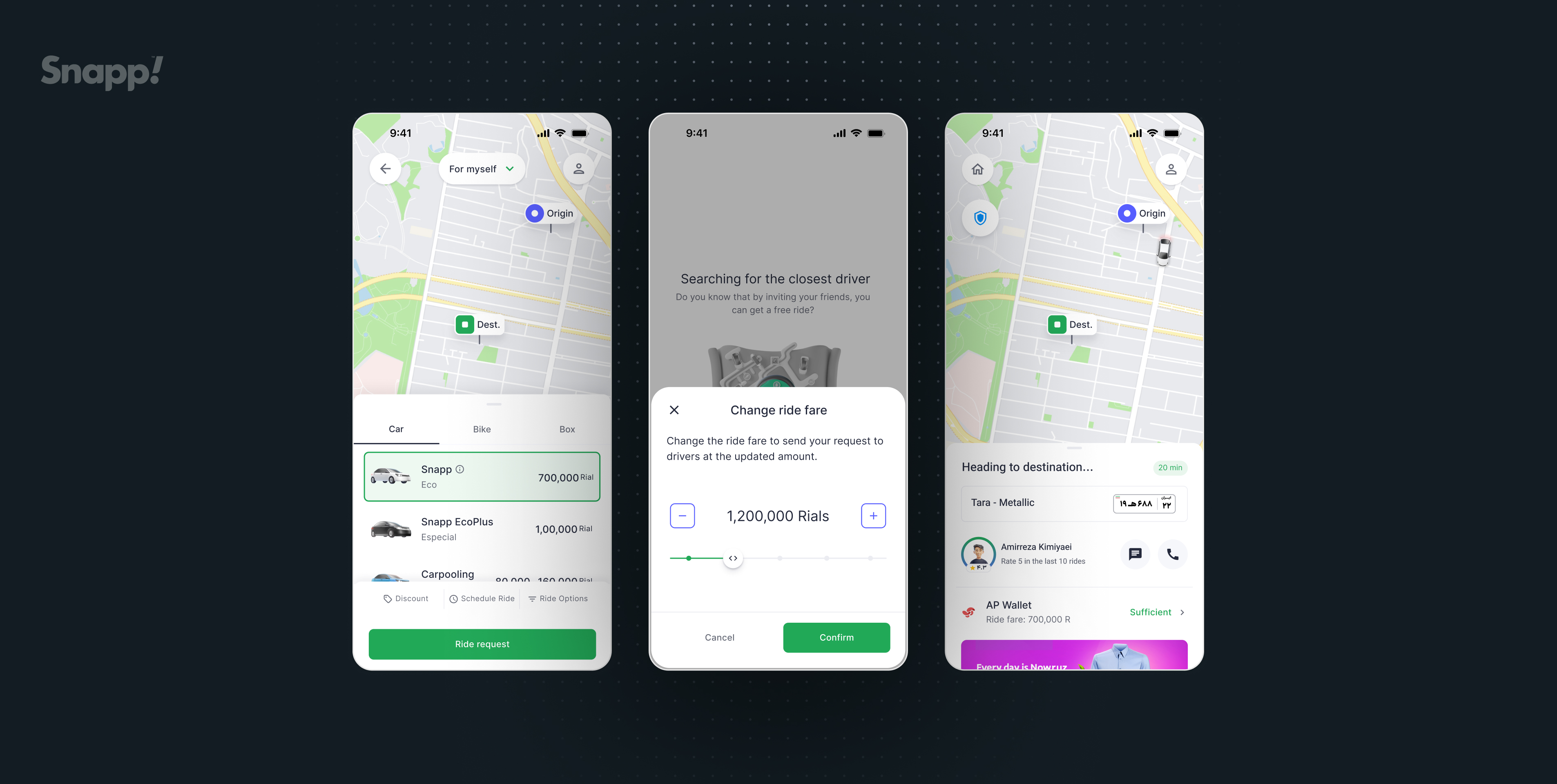
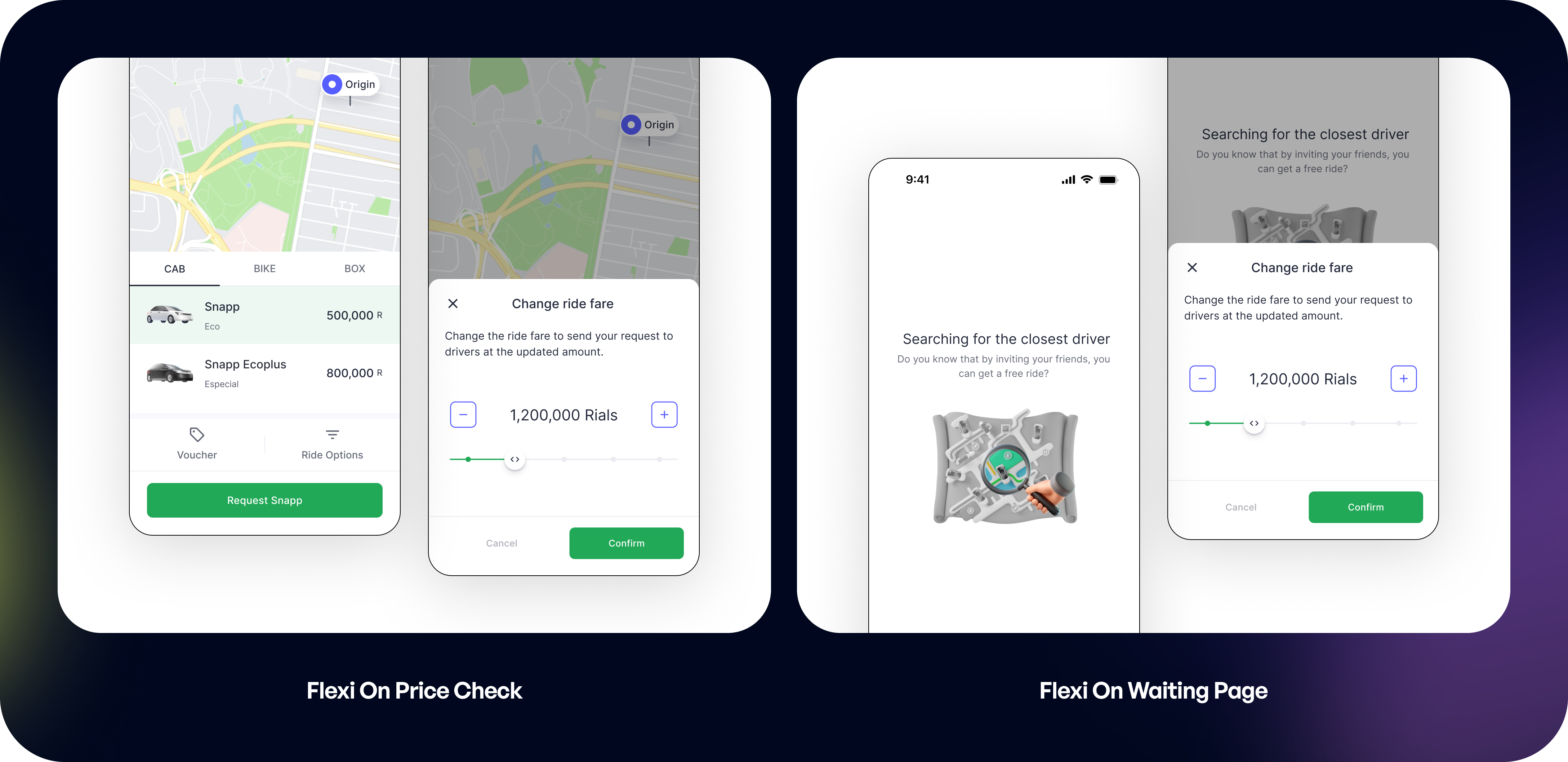
To solve this, we kept the flow simple and added a clear, focused moment where passengers could adjust their fare. After requesting a ride, if they notice that drivers aren’t accepting, they can tap “Change ride fare” on the waiting screen. A bottom sheet opens with a single job: let the passenger choose how much more they’re willing to pay.
.gif)
The control is built around stepped price points instead of a fully open range. The slider moves in ~20% increments, and the + / – buttons let passengers fine-tune the amount without needing dozens of taps. The current fare is always visible in the center, with supporting copy that explains what’s happening: you’re resending your request to drivers at this new price.
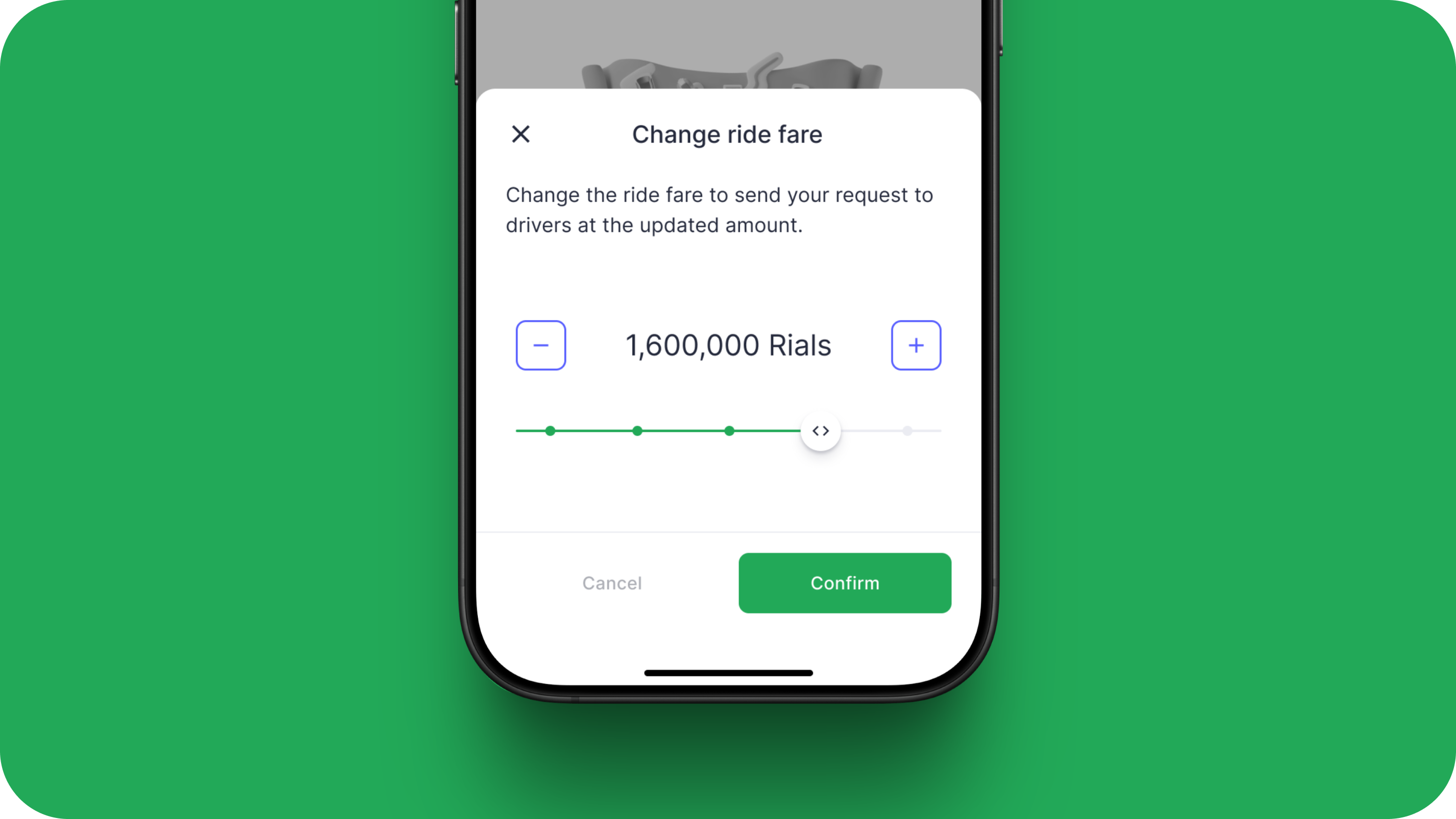
Visually, the bottom sheet is lightweight and focused: one clear title, one line of explanation, the price control, and two actions, Cancel or Confirm. No extra ride types, no hidden behavior. This keeps the interaction fast for time-sensitive passengers, understandable at a glance, and simple enough to fit within our technical and regulatory constraints.
5.1. Stepped vs. Open Range Controls
The final design utilizes a stepped slider supported by explicit plus and minus buttons (like 1,200,000 Rials shown).
This choice was crucial because the earlier, open-range concepts were technically challenging. It was difficult for the backend to accurately and quickly calculate the final price when users could select any arbitrary amount within a wide range. The stepped approach simplified the technical logic, ensuring fast processing and reliable pricing.
5.2. Focus on Quick Action and Price Bands
The sheet’s primary goal is singular to "Change ride fare". By placing this action in a focused bottom sheet, it isolates the user's decision from the main map/booking flow, reducing complexity and directing them toward a quick resolution when waiting for a driver (Searching for the closest driver).
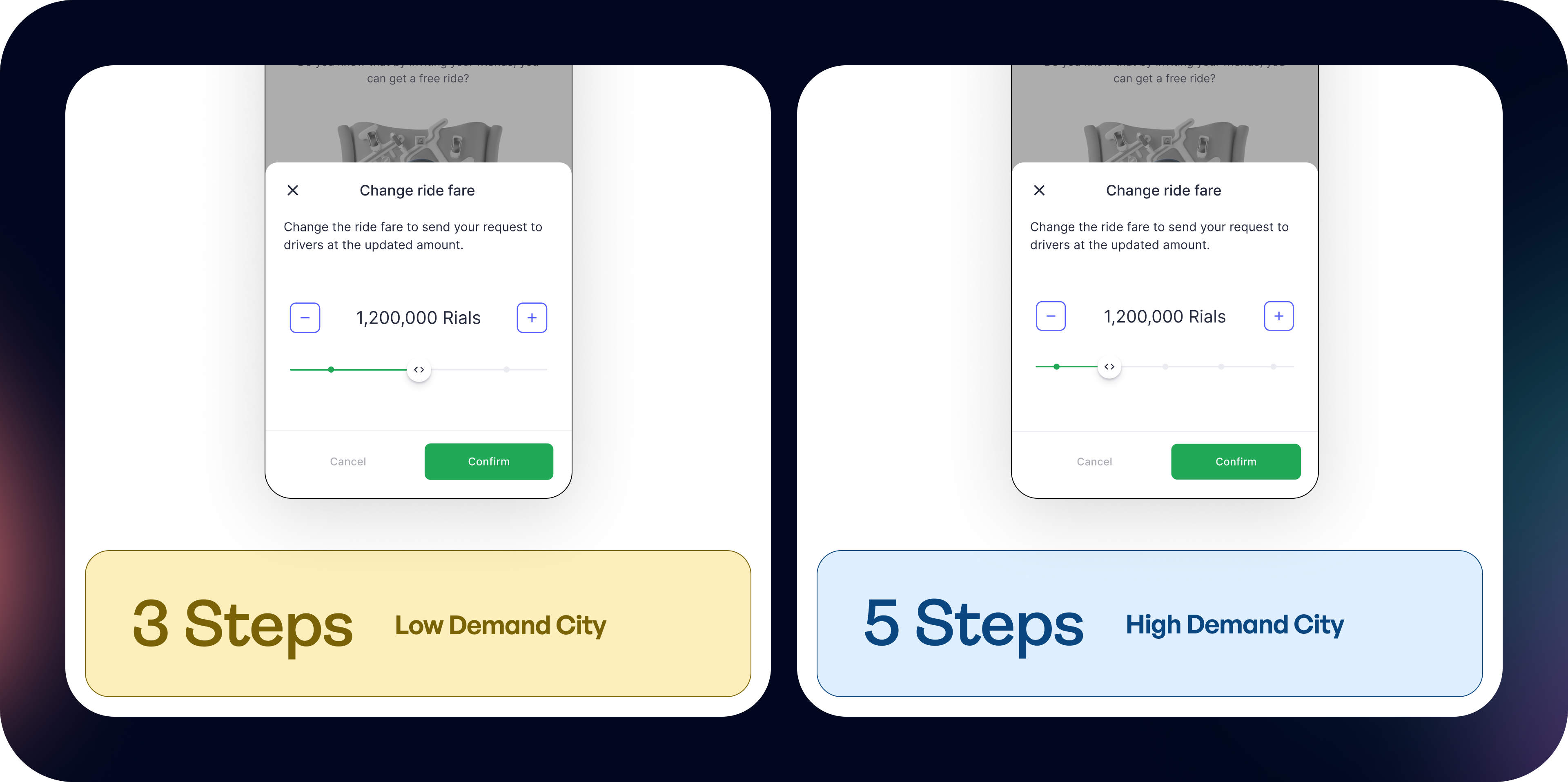
The system auto‑scales to 3 or 4 fare options in lower‑demand cities, and expands to 5+ in metros where more price sensitivity exists. Users only see the choices that matter for their market.
5.3. Waiting Page or Price Check
We placed Flexi in two key surfaces of the booking flow: the Price Check page and the Waiting page. Each surface serves a different user intention, so the design had to support both without adding extra friction.
On the Price Check page, Flexi acts as an “upfront choice.” At this point, passengers are still deciding whether to request a ride, so it’s a good moment to set a preferred fare before committing. This helps users who want to increase their chances right from the beginning, without rushing or reacting to delays later. It also keeps the main card clean, because the slider sits inside a focused bottom sheet that opens only when needed.
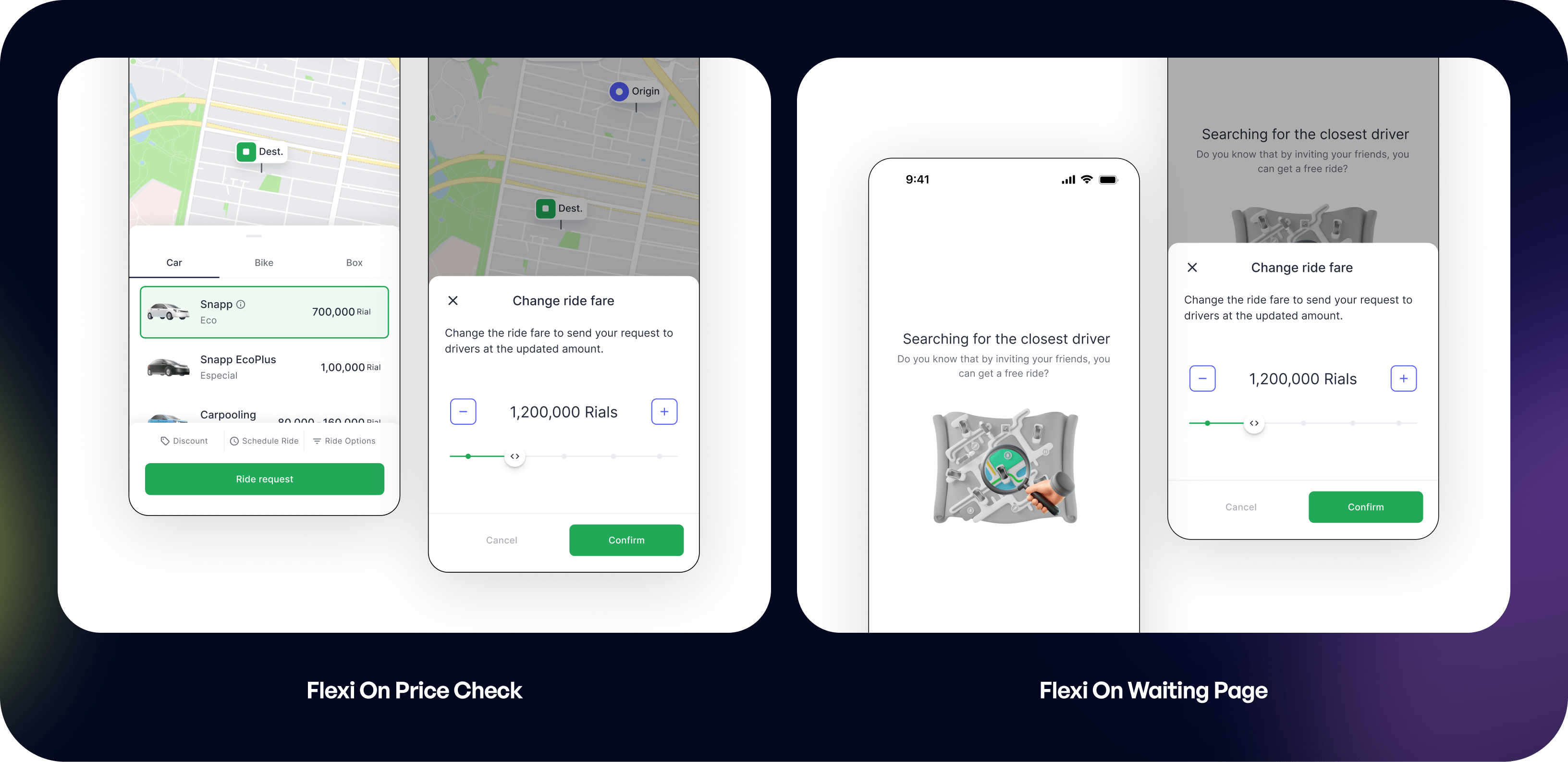
On the Waiting page, Flexi works as a quick reaction tool. When a passenger sees that drivers are not accepting their request, they can raise their fare instantly without restarting the flow. This is especially helpful for people in time-sensitive situations. We removed anything unnecessary here and kept the interaction fast and simple, since the user’s priority is to get matched as soon as possible.
5.4. Price Check Page or Waiting Page
Passenger is still deciding whether the standard fare and pickup time are acceptable. Some are willing to pay a bit more up front if it means a quicker match.
Passenger sees the ETA stuck or rising, anxious and time-sensitive users want a way to nudge drivers without canceling and rebooking. Gives riders a last-mile control lever to shorten lingering waits, improving perceived fairness and reducing cancellations from urgency.
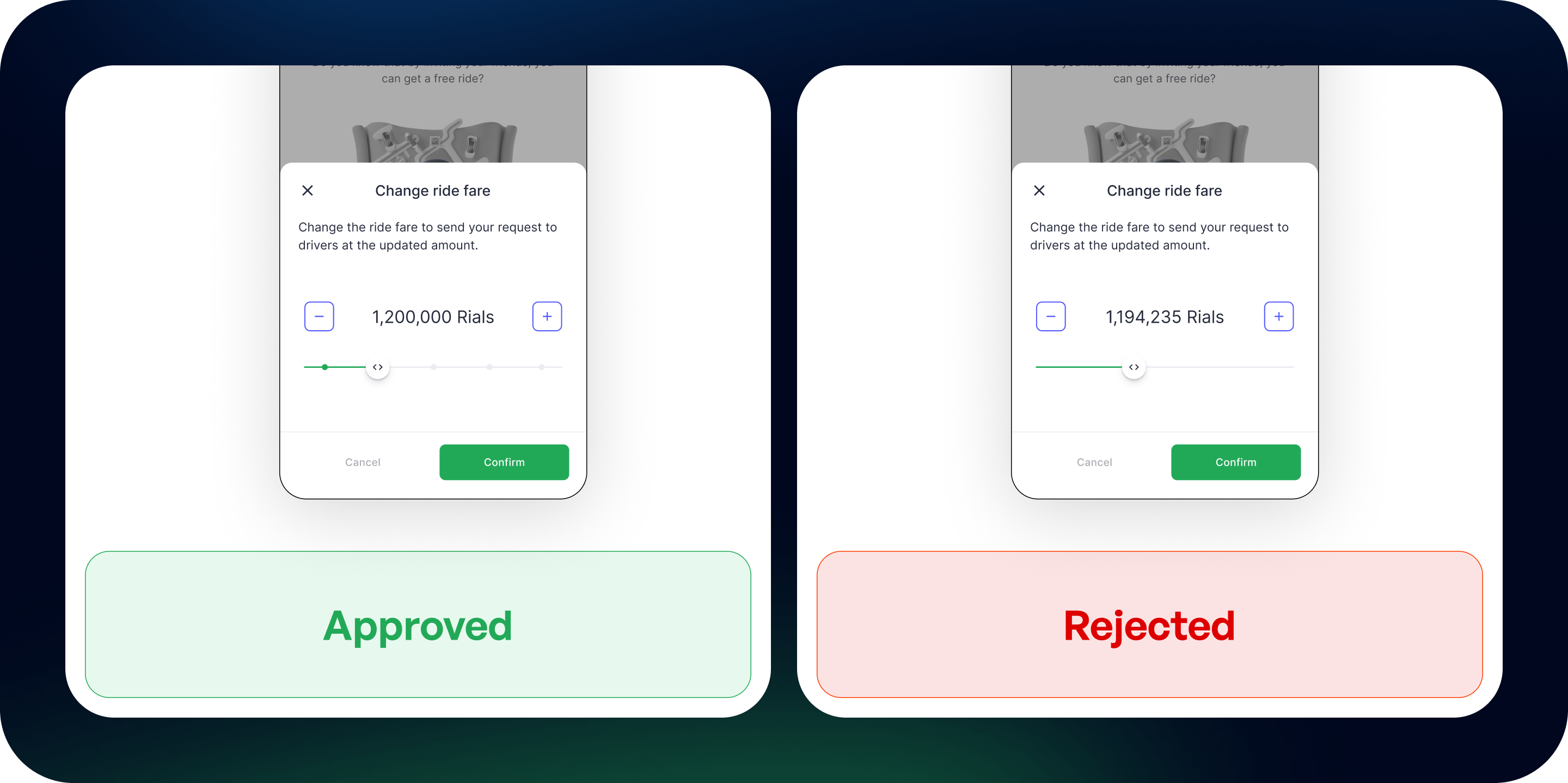
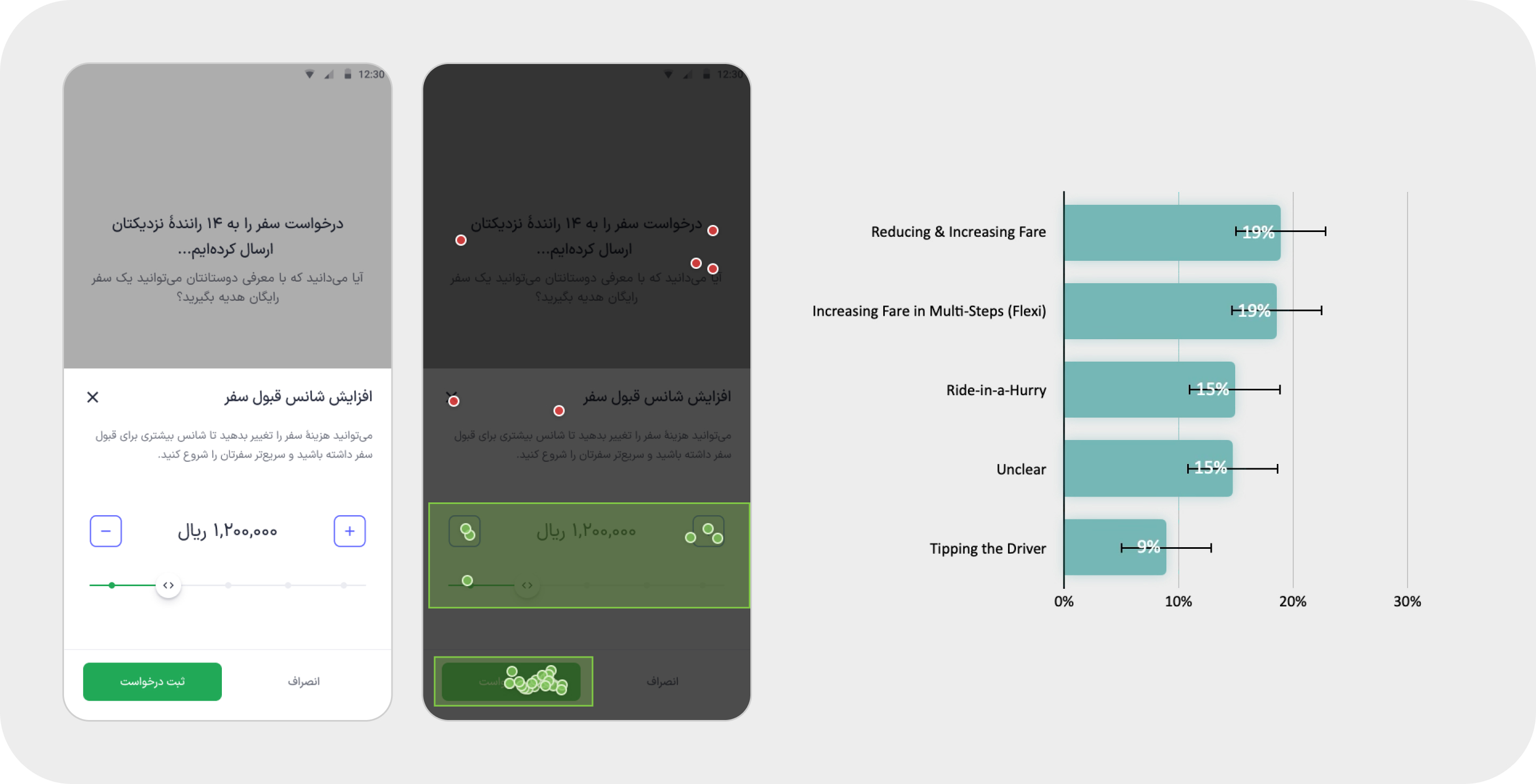
6. Test and Improve
Here how Flexi Pricing is presented and used on the waiting page, alongside users’ mental comparison with previous alternatives such as Ride-in-a-Hurry and tipping the driver. At this stage, the research data was not yet complete, so the test section is intentionally not included here.
7. Next Steps
7.1. Flexi Upfront
As a next step, we designed Flexi Upfront, letting passengers choose their preferred fare before requesting a ride, directly on the price check page. Instead of waiting to see if drivers would accept and then increasing the fare on the waiting screen, passengers could set their price from the start based on how urgent their trip was.
7.2. Surge Transparency
When surge is active, the bottom sheet shows a banner that some price points may exceed the standard rate cap set for phone-based taxi services, and passengers immediately see the value of paying more during busy periods.
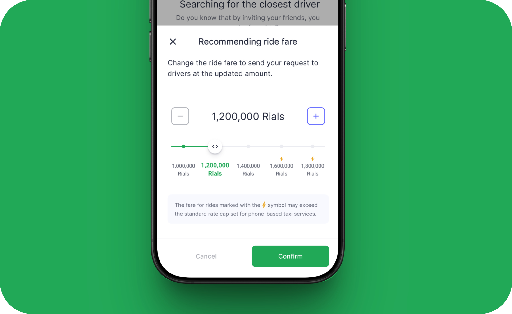
This added transparency reassures riders that the price increase is temporary, demand-driven, and ultimately designed to reduce their wait in busy moments.
8. Conclusion
Flexi Pricing started as a response to a sudden gap in our system, but it grew into a feature that reshaped how passengers and drivers interact during high-demand moments. By simplifying the experience, reducing friction, and giving passengers a transparent, opt-in way to improve their chances of getting a faster ride, we restored marketplace balance without violating government rules or creating new frustration in the flow.
The final solution may look simple, but it came from many rounds of exploration, internal feedback, and careful trade-offs between user needs, business constraints, and technical limitations. In the end, Flexi Pricing delivered real impact: faster pickups, higher driver earnings, and a meaningful lift in company revenue, while still keeping the experience fair and intuitive.
9. Looking back 📝
1. Dive deep and ship fast: The experiments and research we conducted significantly boosted my confidence in designing the product and determining the best direction for this feature.
2. Explore, iterate, iterate: Iterating during user testing was definitely challenging. However, staying up late to refine prototypes was worth it when I saw the final results of the feature and design.
3. Be adaptable. Prioritize. Delegate: The requirements changed multiple times, and engineers frequently raised technical limitations as they evolved. Through this, I learned to adapt to shifting demands, prioritize my daily tasks, and delegate responsibilities effectively.


Working with Abe on the Flexi Pricing feature was a total win for our team. He took our business goals and turned them into a clear, intuitive experience in just a few rapid prototypes. His designs fit perfectly within our technical limits and tested really well with users, so we launched smoothly and saw strong early results.
Next Project